
Infographics are a really eye-catching and simple way to present your library data and information visually. Maybe you have run a student survey or perhaps you’re making an annual report for your superiors. Whatever the data, you can make it interesting, and quickly viewable, (and show off your IT skills!) by creating an Infographic.
There are multiple websites that allow you to create free infographics, such as canva, infogr.am and venngage. I have been using Piktochart.
Piktochart offers a few free templates, although these are somewhat lacking. I am yet to peruse the free templates on other sites, but they may have more to offer. If you’re feeling brave, you can simply make a free inforgraphic from scratch.
Luckily, my institution has a paid membership to Piktochart so I can utilise many more templates and functionalities. Piktochart also offers free tutorials on using the program and has some really helpful hints in their blog, such as ‘cheat sheets‘. (The one linked here describes six basic layouts for displaying most types of information, as well as discussing the use of ‘white space’).

I have found inforgraphics to be a great simple tool to present information at a glance. Not only can you present data from surveys or library statistics, you can also use it to share library information with students in a fun, colourful and interesting way. We have started using them for quick reference study guides and ‘How to’ instructions as well. The likelihood of young people taking something away from one of these infographics seems a lot higher than when showing them some drab excel pie chart or a page of text!
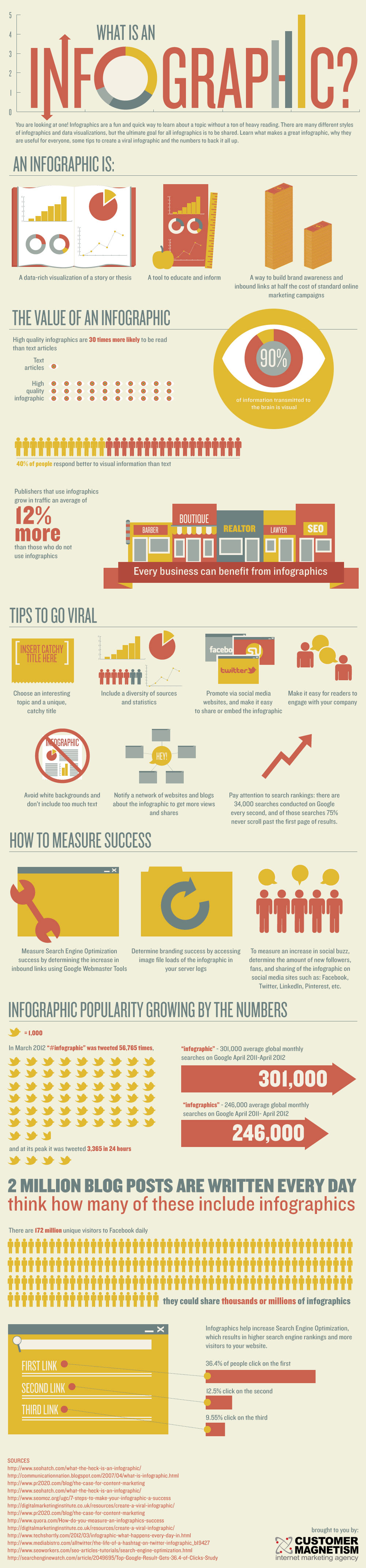
Below is an infographic on using infographics – with all the convincing facts and figures you need!
I hope this has enticed you to try out something new next time you have some information or data that needs to be shared.
Thanks for reading! 🙂
Michelle De Aizpurua
Created by Customer Magnetism.

Reblogged this on margaretlibstudies and commented:
I’ve seen plenty of infographics around (and have linked to some on my Resources page), but hadn’t put much thought into how they are created. They’re a great tool for relaying information in a visual manner.
LikeLiked by 1 person
I am a MLS librarian by formal training and past jobs. Admittedly I didn’t create any Piktochart about anything related to information management. More um..narcissistic. https://cyclewriteblog.wordpress.com/2015/08/14/crafting-my-personal-blogger-infographic/
LikeLiked by 1 person
I think it might be useful that librarians create an infographic about themselves. The general public have no clue what an eclectic bunch we are.
LikeLike
Thanks for sharing Jean, that’s a great infographic and shows the variety of topics they can be utilised for! As you said, even resumes can be in infographic form! And I agree it can be frustrating constantly explaining my career (and its depth and worth!) to people, I’d love to have a simple graphic to refer them to 🙂
LikeLike
I just realized I could create an infographic, not of my resume but of some cool highlights of people / situations that I’ve met/encountered in my career. I’ve learned enormously ..my clients were engineers, judges, firefighters, accountants, lawyers…. Some stories to tell that are less info related, but more on people themselves.
LikeLiked by 1 person